Online to Offline – O2O
Language selection 📢
Published on: September 21, 2020 / update from: September 21, 2020 - Author: Konrad Wolfenstein
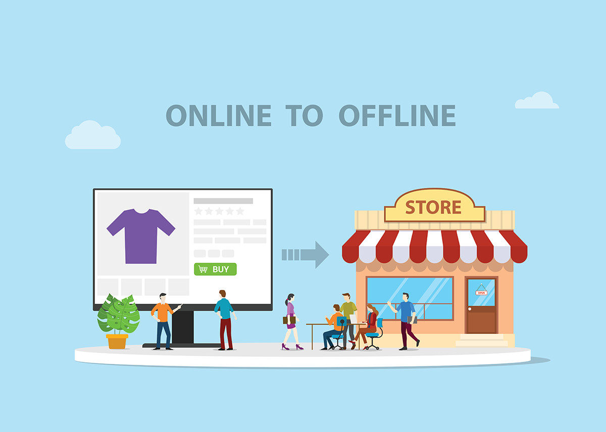
Online to Offline, abbreviated O2O, refers to digital applications in retail that transform offline points such as advertising material and the products themselves into digital sales areas.
O2O, as a sub-area of the Internet of Things (IoT), is primarily concerned with solutions in retail. Physical objects such as print advertisements, posters, catalogs, the products themselves are transformed from a point of interest (POI) to a point of sale (POS) via a digital application. The Dash buttons from Amazon or the Swiss online retailer Brack are examples of online to offline solutions. The physical Dash buttons allow products to be purchased at the push of a button. The corresponding business term for this type of order is replenishment. Replenishment currently primarily focuses on habitual purchases. This primarily includes everyday items.
Point of Interest (POI)
“Place of interest”, literally “place of interest”. A term from marketing.
POIs are sales points that are particularly important for selling products. The POIs can be used in various sales channels to promote sales of a specific product. POI refers to a place where interested parties can find out about products from one or more providers, e.g. E.g. trade, trade fairs, public places (via a kiosk system), at home (e.g. via the Internet). A multimedia system is often used to convey information. Due to the increasing spread of electronic business and the integration of ordering options, the POI is increasingly identical to the point of sale (POS).
Point of Sale (POS) – Point of Purchase (POP)
The term “sales place” describes the place where the sale is carried out. For the buyer (consumer) it is the Point of Purchase (POP), the shopping site. So the place where the purchase is carried out.
In the broadest sense, a retail location is the building or shopping center in which a retail store is located. A visible design of the building, the facade and the outdoor advertising (labeling, illuminated advertising) is important in order to achieve a long-distance effect and to address potential customers from afar. In the narrower sense, the sales location is the shop itself. In terms of design, an inviting entrance design, shop window design, color and lighting design are important. By presenting the goods in the shop window or at a contact point (in the store, on the shelf), the provider wants to trigger positive emotions in the buyer and arouse the intention to buy this product. The checkout should not be visible from the entrance area so as not to remind the customer that they have to pay for their purchase (positive feeling) (negative feeling).
The design of shops with self -service has the task of leading the customer into the back business area so that the entire area is optimally used. The lighting design is important: the brightness of the interior lighting must increase from the entrance to the rear area. The shelves are placed according to special plans that take the running logic into account. These plans are based on the knowledge of the viewing behavior of the consumers, for example the right corner behind the entrance door is considered to be very weak and all areas that the customer has in mind are considered to be strong. Many additional shelves are apparently “in the way” - they stand out and lead to increased sales of the goods presented.
The layer design refers to three levels of the shelf height. The first (= lowest) level serves to sell directly. It is further divided into the optimal sales area, which is located in the gripping and eye level of the consumers, as well as the bück and extension area, which are weaker for themselves. Goods whose sale is to be funded must be placed at eye level. The top “third level” serves to orientate customers and contains information signs and symbols on the goods offered underneath. Such are huge advertising medium (inflatable giants), for example a huge banana for the fruit department or an oversized soft toy for the toy dividing.
The aim of the POS (seller view) or pop (buyer view) is to stimulate spontaneous purchases in the last minute before numbers at the cash register. Goods are also placed in front of the cash register (secondary placement) and not at the regular place. The customer decides on buying a product himself and a pleasing, appealing display of the goods is necessary. The sales points are with displays, “shelf stops”, window adhesive, demo and tasting stalls, action boards, arrows, “rotairs” (movable posters that hang on a cord from the ceiling and turn around your own axis), baskets, towers, floor adhesive, product feed systems. A background music (instrumental pieces) and “scale”, which is only just above the prevailing noise level, have a supportive effect. Likewise, “feel -good climate” such as temperature and suitable humidity is used to buy.
In addition to these basic design elements, a positive atmosphere is increasingly generated when shopping to suggest a feeling of experience when shopping. This development is particularly necessary in wholesale and retail in order to maintain a competitive advantage. The frequently used elements of psychological stimulation include scenting, color design and music at the POS.
The short form POS stands for “Point of Sale” and “Point of Service”, whereby a demarcation between the two can be vague.
Electronic Point of Sale (EPOS)
A further development of the POS is the Electronic Point of Sale (EPOS). This is a retail system in which the barcode of the product sold at the checkout is scanned. The sale is then immediately compared with the warehouse via a computer system. The individual product marked as sold is removed from the inventory and the stock level is automatically corrected.


